
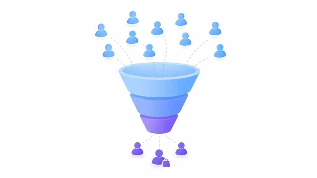
Ecommerce conversion rate optimization (CRO) is the process of turning more of your existing website visitors into paying customers, without spending more on traffic to do it. Most visitors who leave without buying aren’t uninterested; they’re hitting friction: a checkout that asks too much, a shipping cost that shows up too late, a product page that doesn’t answer their real question. I’ve spent enough time in ecommerce builds to know the fix is rarely “redesign everything”; it’s usually a handful of specific, fixable problems standing between a visitor and a completed order.
Below, I’ll cover what CRO actually means, the real factors dragging your conversion rate down, the specific fixes that move the needle, and how to actually test and prioritize changes instead of guessing. This is a long, complete guide- everything I think a store owner or marketer actually needs on this topic in one place.
What Does CRO Mean, and How Do I Calculate It?
CRO stands for conversion rate optimization, the practice of increasing the percentage of website visitors who complete a desired action; in ecommerce, that’s almost always a completed purchase. The formula itself is simple:
If your store had 70 sales from 5,000 visitors last month, your conversion rate is 1.4%. That single number, tracked consistently, is one of the most reliable signals of whether your site is actually working for the traffic it already has, before you spend another dollar trying to get more of it.
It’s worth separating two related ideas here, since they get used interchangeably but aren’t quite the same thing. CRO is specifically about the process of improving that number through deliberate, tested changes. UX (user experience) is about the overall quality of how a visitor experiences your site.
What’s a Good Ecommerce Conversion Rate?
There’s no single number that qualifies as “good” across the board; it depends heavily on your traffic source, device mix, product type, and industry. But real benchmark data gives you a useful frame of reference:
A few things worth understanding about why these numbers vary so much:
| ✓ | Traffic source matters more than most people expect. Organic traffic (people who searched for you specifically) converts meaningfully better than cold paid social traffic, since intent is already higher before they land on your site. |
| ✓ | Device isn’t a small factor. Mobile traffic typically converts at roughly half the rate of desktop, not because mobile shoppers are less interested, but because mobile checkout friction (small tap targets, slower typing, page speed) quietly costs you conversions along the way. |
| ✓ | Product type sets a real ceiling. A $15 impulse purchase and a $3,000 piece of jewelry are never going to convert at the same rate; no amount of CRO changes that underlying buying behavior. |
One number worth internalizing regardless of your industry benchmark: going from a 2% conversion rate to 3% isn’t a “1% improvement”; it’s a 50% increase in revenue from the same traffic. That’s the real case for CRO; it’s leverage on traffic you’re already paying for or already earning through SEO, not a request for a bigger budget.
My honest advice: don’t chase the industry average. Whatever your current conversion rate is, that’s your real baseline, and the only benchmark that actually matters is beating your own number, month over month. Comparing yourself to a luxury jewelry brand’s 1% or a snack brand’s 6% tells you very little about whether your specific site is actually improving.
What Factors Negatively Affect Conversion Rate Optimization?
Before fixing anything, it helps to know exactly what’s working against you. Based on real usability research, a small, consistent set of issues accounts for the majority of lost conversions, and none of them are exotic.
Two of these are worth sitting with a bit longer, since they’re more counterintuitive than they first appear.
Forced account creation is a bigger problem than most stores realize. It feels like a reasonable ask; you’re building a customer relationship, after all, but it’s a well-documented driver of order abandonment specifically at the moment someone was ready to buy. Always default to guest checkout, and explain the benefit of creating an account after the purchase is complete, not before.
Live chat can hurt as often as it helps. Non-user-initiated chat pop-ups, the ones that interrupt someone browsing, are consistently perceived as annoying rather than helpful. Chat is genuinely useful when a visitor has a specific question and seeks it out themselves; it backfires when it’s pushed on them uninvited.
The pattern across nearly all of these: the friction is rarely dramatic. It’s small, cumulative annoyances, an extra form field here, a hidden cost there, that individually seem minor but compound into a visitor quietly closing the tab instead of completing a purchase.
How Do I Optimize My Ecommerce Checkout for Higher Conversions?
Checkout is where CRO effort pays off fastest, since these are visitors who already decided to buy; they’re just being stopped by something in the process itself. Checkout abandonment rates average around 70% across ecommerce broadly, so if you’re seeing similar numbers, you’re not an outlier; you have real, fixable friction like everyone else.
That last one is worth explaining, since it sounds counterintuitive. Empty form fields draw a disproportionate amount of attention, and a visible “Coupon Code” field specifically triggers something psychological: once a visitor notices it, they often feel like they’re being charged more than they should be, even if they never had a coupon to begin with. Collapsing it behind a small link keeps the option available without planting that doubt in the first place.

Trust signals matter more at this exact step than anywhere else on your site. Research consistently shows two things: visitors judge different parts of the same page as more or less trustworthy depending on design alone, and that judgment is largely a gut reaction- how secure the page looks, not just how much they already trust your brand. SSL badges, recognizable payment icons, and a visible security cue near the card entry fields all genuinely help, but only if they’re placed where a hesitant visitor’s eyes actually land.
On mobile specifically, checkout needs its own attention beyond just “responsive design.” Sticky add-to-cart and checkout buttons, native payment options like Apple Pay and Google Pay that eliminate manual typing entirely, and simplified navigation all matter more here than on desktop, since mobile already converts at roughly half the desktop rate before you even account for checkout friction specifically. This is exactly the kind of thing that gets built in from the start on ecommerce projects, rather than retrofitting it after launch.
What Are the Best Ecommerce CRO Practices for Product Pages?
If checkout is where hesitant buyers get stopped, the product page is where they decide whether to become hesitant buyers in the first place. Get this page wrong, and a strong checkout never even gets the chance to matter.
Product photography carries more weight than most stores budget for. In large-scale usability testing, 56% of users immediately began examining product images the moment they arrived on a product page, before reading a single word of copy. Yet only 25% of ecommerce sites provide images sufficient for a visitor to actually evaluate what they’re buying: no meaningful zoom, too few angles, low resolution. Blurry or inadequate images are one of the fastest ways to lose a visitor who was otherwise ready to buy.

Reviews function as a trust shortcut, not just social proof. Up to 95% of shoppers rely on reviews to evaluate a product or confirm their decision, and they’re specifically looking for two things: the average rating and how many ratings that average is based on. Showing a 4.8-star rating means very little if it’s based on 3 reviews; showing both numbers together builds real confidence.
Product descriptions need to answer the question the visitor actually has, not just describe the item. Vague copy without dimensions, materials, or compatibility details leaves a visitor guessing, and most won’t take a chance on an unclear purchase; they’ll simply leave and buy from a competitor who answered the question clearly. Specificity here isn’t about writing more; it’s about writing the details a hesitant buyer is actually looking for.
One smaller but genuinely useful fix: if a visitor searches while browsing within a category, that search should stay scoped to that category by default. Returning broad, site-wide results when someone was clearly narrowing down within “Winter Boots” breaks an assumption they didn’t even realize they were making, and it’s an easy miss that costs real conversions on category-heavy stores.
What Metrics Should I Track for CRO?
You can’t improve what you’re not measuring, and tracking the wrong metrics is almost as costly as tracking none at all. Here’s what actually matters, and what each one tells you.
Beyond the final sale, micro-conversions tell you where your funnel is actually leaking. These are smaller signals of intent along the way- adding an item to a cart or wishlist, starting the checkout process, entering payment details- that show you where visitors are engaging versus where they’re quietly dropping off. If 500 visitors add something to their cart but only 10 complete a purchase, that gap is telling you something specific: the problem isn’t your product pages; it’s somewhere in checkout.
This matters because it changes where you spend your fixing effort. High add-to-cart numbers paired with low checkout completion point squarely at your payment flow, not your product photography. Chasing the wrong fix, redesigning product pages when checkout is the actual leak, wastes real time solving a problem that isn’t costing you sales.
Revenue per visitor (RPV) deserves special attention since it’s the metric that ties everything together. A store with a lower conversion rate but a meaningfully higher average order value can genuinely outperform a “better converting” competitor in actual revenue. Optimizing for conversion rate alone, without watching AOV alongside it, can lead you to changes that convert more visitors but generate less total revenue; discounting aggressively is the classic example of this trap.
How Do I Take a Data-Driven Approach to CRO?
Standard analytics tools like Google Analytics can tell you what happened- users dropped off at checkout, but not why. That gap is where most CRO efforts stall out into guesswork: a hidden fee, a broken form field, and a confusing mobile layout can all produce the same drop-off number, but they need completely different fixes.
This is where behavioral data earns its place alongside standard analytics:
A concrete example of how this plays out: a heatmap might reveal that 50% of visitors scroll straight past your most important product page elements, meaning your price or CTA simply isn’t getting seen, not that visitors saw it and decided against buying. Those are two completely different problems requiring two completely different fixes, and only behavioral data tells you which one you’re actually dealing with.

Once you have that evidence, it changes how you talk about proposed changes internally too. Instead of “I think we should move the reviews section higher,” you can say something closer to: “We expect moving the reviews section up will increase purchases, because only 20% of visitors currently scroll far enough to see it.” That’s the difference between a hunch and a testable hypothesis, and it’s a much easier case to make to a skeptical stakeholder or client.
Abandoned cart recovery is a good example of where this pays off directly. Generic recovery emails (“you left something behind!”) work reasonably well on timing alone, sent within 60 minutes, followed up within 24 hours, then an SMS at 48 hours if still unconverted. But behavioral data lets you go further: a visitor who rage-clicked at a broken shipping calculator before leaving has a different problem than one who simply got distracted and closed the tab, and a tailored message addressing the actual reason converts meaningfully better than a generic discount blast sent to everyone the same way.
How Do I Test and Broaden My CRO Program Over Time?
Once you’ve identified real friction points, the temptation is to fix everything at once. Resist it. Untested changes based on a hunch, even an educated one, can just as easily hurt conversions as help them. This is where a real testing framework matters.
The ICE framework is a simple, effective way to prioritize what to test first, weighing every idea against three factors:
Confidence should be backed by real evidence, not preference. A test idea supported by hundreds of documented rage clicks on a specific element is a far stronger candidate than one based on someone’s personal design opinion, no matter how experienced that person is.
A/B testing turns a hypothesis into an actual answer, but only if it’s run correctly:
| ✓ | Test one variable at a time; changing multiple things at once makes it impossible to know which change actually drove the result |
| ✓ | Run tests during standard traffic periods; avoid launching during Black Friday or other seasonal spikes that skew normal behavior |
| ✓ | Run until you hit statistical significance, generally 95% or higher; stopping early on a promising-looking trend is one of the most common ways test results turn out to be wrong |
The real shift that separates ongoing CRO programs from one-off projects is timing. Reactive CRO happens when abandonment becomes painfully obvious, and someone finally investigates. Ongoing CRO treats testing as a regular, scheduled part of how the business operates, catching and addressing friction as it emerges instead of after it’s already cost you months of lost conversions. Once a store’s fundamentals are solid, this kind of continuous monitoring and testing is exactly the sort of thing that fits naturally into ongoing website maintenance, rather than a one-time project with a finish line.
One habit worth building early: document what you tested and what you learned, even from tests that didn’t win. Without that record, teams tend to quietly retest the same ideas months later, having forgotten they already tried it and it didn’t move the needle.
FAQs
What is the purpose of conversion rate optimization?
The goal of CRO is to get more value from the traffic you already have, rather than needing to spend more to acquire new visitors. It’s the process of increasing the percentage of visitors who complete a purchase (or another meaningful action), through deliberate, tested changes rather than a one-time redesign.
How long does it take to see results from CRO?
Technical “quick wins,” fixing an obviously broken form field or unclear button, can show results within days. Proper A/B testing programs designed to reach statistical significance typically need 2 to 4 weeks per test, depending on your traffic volume.
Can CRO hurt my SEO?
Not if it’s done correctly. As long as you’re using proper canonical tags, avoiding cloaking, and keeping test durations reasonable, CRO and SEO work alongside each other rather than against one another. The two disciplines are more complementary than most people expect, since a site that converts better is usually also a site with a genuinely better user experience, which search engines increasingly factor in too.
What’s the difference between CRO and UX?
UX (user experience) is about the overall quality and usability of your site as a whole. CRO is specifically focused on improving measurable business outcomes, conversions, and revenue, using UX principles as one of its main tools. Good UX work often improves conversions as a side effect, but conversion isn’t UX’s primary goal the way it is for CRO.
Where should I start if I have a limited budget?
Start with checkout; it’s where the most decided, highest-intent visitors are getting stopped, and the fixes (labeling required fields, showing shipping costs earlier, enabling guest checkout) are typically inexpensive to implement relative to their impact. A focused checkout audit before investing in expensive testing software is usually the highest-leverage first move.
Does more traffic automatically mean a better conversion rate?
No, and this trips a lot of store owners up. If traffic increases but conversion rate drops, it’s usually a signal about the quality of that new traffic, not a sign your site got worse. A spike from a broad social media promotion, for example, often brings in less purchase-ready visitors than steady organic search traffic, which is one reason conversion rate should always be read alongside where the traffic is actually coming from.
Bringing It All Together: Your Ecommerce CRO Checklist
Here’s every core action from this guide in one place, roughly in the order I’d tackle them.
Final Thoughts
If there’s one thing worth taking from all of this: most lost conversions aren’t caused by disinterested visitors; they’re caused by small, fixable friction that quietly adds up. A hidden shipping cost here, a blurry product photo there, a checkout form that asks for one field too many. None of it requires a full redesign to fix; it requires paying attention to where visitors are actually getting stuck, and testing your way toward removing it.
The stores that consistently improve aren’t the ones chasing a dramatic overhaul. They’re the ones treating CRO as a discipline, measuring their baseline, fixing specific friction, testing properly, and doing it again next month.
Want to know exactly where your store is losing conversions right now?
Our Ecommerce Solutions team reviews your checkout flow, product pages, and conversion funnel, free, with a prioritized action plan.